Sunday, September 27, 2009

Couple of the latest layouts

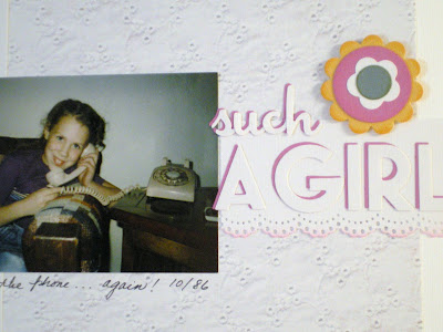
I love working with white but it just refuses to scan well, and in this case, it didn't photograph very well either -- sorry. I did this page for a "white out" challenge on the Scrapbuggy message board. This is daughter, Sally, at 8 years old. Notice our beautiful (gag) beige rotary dial telephone. Wow, does THAT ever make me feel old. LOL


Closer look at the title treatment. I made the flower to match the ribbon using various circle and flower shapes. The fonts are Holiday and Chicago. Lace border punch by Martha Stewart.

Jeffery and Cyndi fishing at one of the Quincy Lakes. He was 2 1/2 here. QuicKutz used are the breakfast skillet (title circles), exclusive arrow by Archivers, and the fonts are Khaki skinny mini and Relax.
Journaling reads: ...can you even see the fish? Jeffery enjoyed the fun of fishing and reeling in the fish he caught but no way would he get close enough to hold it for the photo op, so Cyndi posed with his BIG CATCH.

Saturday, September 26, 2009

Gracie's Hat

Grace fell in love with this hat the minute she saw it and wanted it for so long, Cyndi told me later. She wore it around the store until we found grampa so we could show him how cute she was in it. He couldn't say no. Grace wore it every day. By the time it finally died, it had been really well worn and very well-loved!

Quickutz used:
Holiday font
Nesting stars
USA set stars
Cowboy hat

Friday, September 18, 2009

The Story of Dorothy

It's perfectly normal for kids to go though the imaginary friend phase. In Gracie's case, her imaginary friends are tangible. Still imginary, sort of, but also the kind of friend she can carry, talk to and share with. Such was Dorothy. This is not just any old rock sitting on a piece of bubble wrap. Meet, Dorothy, Gracie's friend. "See her lying on her blanket? Grace points out. "She's having some juice before she takes her nap." And here, pictured below, is Dorothy, on her blanket of bubble wrap. These are the kind of memories scrapbooking is all about. :)


QK used on this layout:
Lace flower border
cookie cutter flower shapes
mini daisies
leaves
Maddie Anne alphabet

Tuesday, September 15, 2009

Loving the new QK font, Holiday

Apple and green stripe papers are Stampin Up, red dot paper is by Doodlebug. QK used are the place setting (the large circle is the plate from that doublekutz 4x4 die), nesting circles, Reuse gift set (the scallop trim in the red circle), 2x2 open book and scallop border die. Fonts are Studio skinny mini and Holiday 4x8.

Grace had no interest in learning to read before she started school. I was, however, successful teaching her to write her name but that's as far as she cared to go without a real teacher and in a classroom. I was completely blown away how quickly she learned to read once she was in school. Not that I was surprised that she could do it, but at how fast she caught on to sound out letters and putting them together. She's now in 3rd grade and reads and comprehends far above elementary school level. It was so awesome to hear her actually read the story to grampa rather than making it up as she went along going by the pictures. :)

Monday, September 14, 2009

Have I mentioned how big a font freak I am??

Well, QK has done it to me again.....this newest font, Holiday, is just too cute. It's fun, playful, and happy with a retro edge. And I think it has become my new favorite script-style font.

On this page I've paired the new Holiday alphabet with the Teriyaki cc alphabet for the title, and the Rev. 0261 sparkle and this month's QK Club die sparkle worked great to show the awe and wonder of "The Box" (see journaling). Scallop border also used on this page. Journaling box is by spellbinders.


For this one, I did the shadow treatment for the title a little differently than I usually do. Instead of adhereing the shadow directly to the back of the letter, I adhered it to the page then used foam tape to pop the letters off the shadows.


Journaling:
This box used to contain all of my scrapbooking supplies. Yes, all of them!! It was the first thing I ever bought for scrapping and had 1600 pieces—a kit from QVC. Fast forward to my scraproom of today and you'd never know I once had no supplies! Of course, I had only started scrapping about six months prior to when this photo was taken in January, 2003. Back then, Grace was a month shy of three and already enjoyed crafting with me. She loved to look inside at all the stickers and pretty papers. She called it THE BOX and sometimes the first thing she wanted to do when she woke up was get out THE BOX. She's been scrapping with me ever since and I'm thrilled she enjoys it so much!

*****

On the next layout I've used the Rev. 0261 sparkles die and scallop borders again, as well as the Rev.0255 snowman this time. Again, I used the Holiday font for the title, this time embellishing the "A" with angel wings, which are really the fronds from the RS0565 palm tree die. For the cute matching brads, I used the ITop Bradmaker by Imaginese. Oh, and the tiny heart on the snowman's hat is from the Katie Skinny Mini alpha.


****

Once again, the Holiday alphabet for the title on this layout. In addition, I've used the 2x2 sign RS0265, rocks KS0439, and the picket fence border. The pics are a tad dark, but in the lower photo you can see the rock she plunked down in the hole she dug. LOL

Journaling:
Me: What are you planting in your rock garden, Grace?
Grace: Rocks, grama.
Me: Why of course.


***
And last, but not least, a bright and bold child's card using Holiday and Teriyaki fonts and again the Rev sparkle.

Popcorn & A Movie

Grace at 2 sharing popcorn with her beenie bear. Multiple photos, especially this many on one page, is not typically my style, but for this series they had to be together. I kept down the busyness by using only one pattern paper and like-colors and embellishments throughout. Title font is Teriyaki cc alphabet. Love this large, fun, playful font. Other Quickutz used on this page are 2x2 popcorn, nesting solid and outline stars, ice cream tub, tickets, and Archiver's exclusive filmstrip border die, and the new rev. sparkle.

Some of the popcorn is "popped" (LOL) with foam tape for extra dimension. I used yellow ink to add extra butter, just how I like it! ;)


Do you make a scrapping goal each year?

I only started making goals the last couple of years. I decided to do this because I got a rather late start scrapping -- my kids were grown and I had grandkids when I got started -- and have so so many pictures to scrap and plenty of time to do it. Making a goal is sort of my way of better managing my time. As it is, I still waste plenty of it. ;)

Last year I set a very modest goal of 52 layouts, in addition to all the other projects I do throughout the year. I figured one page a week was certainly doable for someone who has all the time in the world! I also figured I would get a lot more done if I set a goal for myself and kept track of what I accomplished. This thinking was the result of a very lazy previous year in which I did a whopping 11 layouts for the entire year. Talk about wasted time. I was so mad at myself I decided I must set a goal to keep myself motivated and get those pictures scrapped! Well I far surpassed that goal so this year I set the goal at 100. I made my goal for the year on September 1, so now it's all gravy for the rest of the year! Woohoo, go me!

Do you set a scrapping goal for yourself? How do you decide what your goal will be for the year? And do you generally make your goal(s)?

Leave a comment to be entered into a drawing for a QuicKutz die! Deadline midnight Friday, September 18.

Friday, September 11, 2009

Autumn colors

I love the colors of fall and the changing of the leaves. It's one of the things I really miss living in the desert region of Washington, having grown up on Puget Sound. In order to add some of that missing fall flavor, I love my colorful wreath that hangs on the front door this time of year.

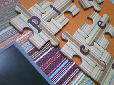
Puzzle pieces are by Scrapworks, rubon letters added, and for the large title piece I covered the A in pattern paper and embellished with markers and die cuts. Fall quote reads: Glorious are the woods in their latest gold and crimson.

QuicKutz used on these pages include the new fall release leaves, twigs, and scroll tree border (leaves only), as well as the 2x2 bushel basket, fall cookie cutter shapes (acorn) and Harvest alphabet.


Another fall collage layout--sorry for the wonky scan!! It's not crooked like this in real life. Journaling poem reads:
by all these lovely tokens
September days are here
with summer's best of weather
and autumn's best of cheer


Thursday, September 03, 2009

Two more old pics pages to share

More favorites of my girls' childhood pictures. For the first layout, I've used QuicKutz dies Roxy alphabet, 2x2 ballcap and dog, 4x4 journaling circle and scallop border.
Sally had such cute droopy cheeks, we called her droopy dog!
For these droopy eyes in the title, I used capital letter O's from the Roxy alphabet and made the centers dark brown; the lids are just partial circles, hand cut.
And here is Sally six years later, showing her first lost tooth. Such a sweetie pie. For this page I used the MaryJane alphabet and nesting stars. The lace border was done with the Martha Stewart Doily Lace border bunch.

Wednesday, September 02, 2009

Finally getting to the older pics *Ü*

I don't even want to think about how many years I've had my photos in a cardboard box on the floor of the closet. Don't shoot me. LOL I just didn't know how I wanted to store them but finally decided on the Cropper Hopper double sided photo storage case. I LOVE that thing!! So much, in fact I ordered a second one. I was able to get all my photos from 1972-1999 in one case. Wow, what a space saver!! It takes up 6" on one shelf rather than a whole 20x20 shelf that the box took up! I highly recommend this storage option.

So, in the process of going through the old pics and getting everything sorted, I've been inspired to scrap some of my favorite pictures. Watch for more of the old pics coming soon. :)

This is my all time favorite picture of Randy and the kids.
QuicKutz used here:
Journaling circle
Disco alphabet
Studio skinny mini alphabet
Special Edition house
Hearts are Cuttlebug


The kids' would always get so tan in the summer. I love their sweet little brown faces in this pic.
Quickutz used:
Stardust alphabet
filmstrip border
swimsuit
flipflops
scallop borders


I altered the swimsuit a bit by trimming it to give it a little more shape, and for the sun, I used the explosion from the pirates release

For the journaling, I ran strips of cardstock through my Dymo label buddy. Love this technique.