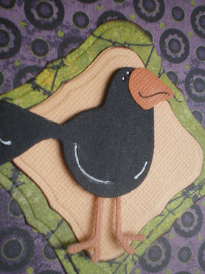
I used my Halloween dies this weekend. I love all the things that go along with Halloween, but I don't like doing the dress up thing or even answering the door for trick or treaters anymore. Isn't that mean? (We do get candy to pass out but we rarely have any kids anymore. I make Randy answer the door. This year I got him a mask to wear.) Guess that comes with old age or something. LOL Still, I do love decorating and making fun spooky things even if I enjoy them all along. ;) Here are a couple of cards to help get you in a spooky mood!
For this card I used the QuicKutz Rev haunted house 044-2, Rev 0241-2, bats, moon and clouds, and for the small ghost, the doublekutz treat bag shape, 0257. Font is Oatmeal. Background paper is Basic Grey from the Eerie collection. Lots of stickles of course, and sheer black ribbon to top it off.


Papers again from the BG Eerie collection. Font here is QK 4x8 Haunted, tree and bats are from the same dies used in the previous card, and the moon is merely a small circle (in this case, the smallest size in the bottle caps dies set), placed back on the die and cut again to create the crescent.

Stickles are a must...

...purple sheer ribbon, and for the background I've used Spellbinders nesting shapes.

I'll be posting more Halloweenie-type projects this week so be sure to come back later and check them out. Hope you're having a great weekend.
Thanks for visiting!


 Inside message:


 The letters for the message on the sign are also from the pumpkin patch die. The "w" is just the "m" turned upside down. You can really make a lot of different messages just with the letters in "pumpkin patch" it turns out!


 ...except for the train, which is a paper by 3 Bugs in a Rug, called All-aboard, from the Animal Stackers collection. So cute! I cut each of the cars individually and popped with foam tape on top of the train border.


 Stickles are a must...
  ...purple sheer ribbon, and for the background I've used Spellbinders nesting shapes.


 The 'happy day' accent is the summer sun die by
 Again using the summer sun die by Cottage Cutz, and the scallop edger die also by Cottage Cutz. The dots and scallop border is a punch by Martha Stewart and the sentiment is a rubon by Making Memories. Pearl bling is Imaginisce i-rock.