Sunday, May 31, 2009

My grandgirls

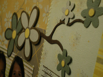
Please meet four of my five sweet granddaughters. Bottom left and clockwise: Mila 4 (just turned 5 on the 20th of this month), sister Olivia 7 (who will be 8 in July), cousin Grace 8, holding her cousin Emmalyn (Emmy) 17 months, sister to Mila and Olivia. Pesky little brother, Feliciano now 4, not pictured. LOL

For this page I used the branch, 2x2 mini daisies, label, Chick-a-dee font, machine stitching, and Making Memories flower stamp. Stamped flowers are handcut.


Tuesday, May 26, 2009

More 'pear' play on words cards

I hope you all had a lovely Memorial Day weekend. Did you fire up the grill? Go camping? Visit with fam and friends? Cyndi, Pat and Grace came over for the weekend and we all went to the Annual Last Stand Rodeo in Coulee City on Saturday. It was only 90 degrees sitting there in the grandstands in the full sun. It was fun though. Then Sunday the girls and I walked to the park where Grace ate her lunch and played on the big toys and the swings. Later we headed to Soap Lake for a bit and just enjoyed the weather for a while. After dinner they hit the road for home. Jeffery decided to stay home this time and didn't come over with them. I'm sure he was glad to have the house to himself and nobody to answer to for a couple of days. What can I say, when I was 15 I enjoyed every minute I had alone too! LOL. It was a great weekend and now I'm just biding my time till school is out and Grace comes to stay for the whole summer. :)

And now, back to scrapping.... ;) The Rev pears and nesting scalloped ovals are two of my assigned dies for this month and I just love them both. They're an easy play on words which is perfect for 'couples' themes. Font for this card is Flirt and the inside message is printed in the matching computer font on a clear label. Papers and brads are from the Basic Grey, Eva collection.


Again using the pears and scalloped ovals, another anniversary, engagement or wedding card.


Friday, May 22, 2009

Table for 2

I LOVE QuicKutz alphas. For this page title I used Honeybee , which I call the Winnie the Pooh font. I love its childlike playfulness and thought it was the perfect choice for this layout of just one of Gracie and Olivia's many, many tea parties. In addition, I've used the 2x2 #2 candle minus the flame, the tree top from Rev0182, vase from the Flirt spring set, rose bud and mug cookie cutter shapes. You'll find a whole list of alphabets on sale at Scrapbuggy if you've been waiting for an awesome price on any of them, now's a great time to check it out before the ones you want are sold out.

(Please excuse the funky color shading across the top. It's not like that in real life but the shadows caused by the buttons made the stitching process wiggy.) Pattern papers and buttons are from the Basic Grey, Mellow, line.


Tuesday, May 19, 2009

Li'l Diva

Love these pics of sweet little Gracie putting on her makeup (I always had clear "eyescara"as she called it, and lipgloss for her as she liked to get dressed up too when I would put on my makeup). As you can see, she couldn't take her eyes off the mirror long enough to look at the camera! LOL

For this page I used the Flirt spring set and alpha (li'l), Yogurt grand alpha (Diva), both scalloped border dies, framed label, flourishes, and the ribbon from the 4x4 pear die from the new wedding themed QK release.

Journaling:
Don't hate me because I'm beautiful
Grace * 2 1/2 yrs old * 7/03
Dressing up at grama's
I used Doodlebug flocking on the makeup brush and crown, in addition to pretty pink bling.

Monday, May 18, 2009

Wedding season is here...

...and the wedding themed May release from QuicKutz is here now too! Just because these are wedding themed, and just because I used them for wedding projects, doesn't mean they can't be used or pages other than wedding. Don't limit yourself! For example, the pears can be used for engagement, wedding or anniversary cards and layouts, or even twins pages. The dresses can be used for prom or dance pages, little girls dress-up layouts, or any formal page. This month's cute cute cute QK club die (did I mention it's super cute!) is adorable lips that would be cute on any love themed layout, Valentine card, or even an "I'm sorry- Let's kiss and make up" card.

This first layout is my niece and nephew-in-law (is that a real 'relation' or did I make that up?) on their wedding day last summer. First of all, are they a beautiful couple, or what?! For this page I used the small nesting scalloped oval and 2x2 dress from the May release, large scallop border die, and the monogram "A" is from the Fiesta font. I used the Eva collection from Basic Grey, rubons, Prima flowers, pebbles, and fancy brads by Making Memories, and computer generated text.

ETA:
In answer to the questions about flourishes and the monogramk the flourishes are all cardstock stickers from the Basic Grey Eva collection that match the pattern papers. The monogram 'box' is also a sticker from that collection with an oval behind it cut from one of the Spellbinders nesting ovals. The A is from the Fiesta font and the "Mr. Mrs." are printed on a clear label. Thanks, Gem, for asking about those. HTH

Close up of just them so you can see better how cute they are. LOL

To make it match Ali's wedding gown, I adorned the dress with stickles.

You might notice on the journaling tag, I used Sue's dry embossing technique to enhance the scallops just to give it an extra punch.

On this card, I used the large nesting scalloped oval and pears (these are so cute, aren't they) from this release, in addition to the hearts from the Flirt Spring gift set, Chick-a-Dee, Tangerine and Tangerine shadows alphabets. The border punch is Martha Stewart, doily lace.

For this layout the pears were the perfect accent to emphasize the title and the lips are just too cute not to incorporate someplace on this page! Journaling is the large nesting scalloped oval, title is Disco and Relax fonts, and flourish is from one of the damask dies. For a little added punch, I pierced the scallops on the oval with a large needle and outlined the journaling. I then outlined the page as well. Pattern papers for this page are Basic Grey, Mellow.


3D pears using foam tape, shadow inking and penwork.


Lips :)

QuicKutz release midnight eastern

which means 9 p.m. tonight here on the west coast. Are you ready? I am!

Monday, May 11, 2009

Peek

Just look at the cute face peeking out from behind her blanket! :) That Emmy is such a little a sweetie pie.....until you try to take the binky. Don't even think about that!!!! LOL


Font is Flirt from the gift set, branch from the Reuse gift set, circle/flower SOF die, large scallop border.

Sunday, May 10, 2009

Redneck Swimm'n Pool

Fun page with the new QK Relax Gift Set. Also used RS0418 medium retro square, QK club die arrow 0013, mini splat from the cookie cutter summer shapes, and the large scallop circle from the Reuse Gift Set. Grace and Jeffery make due with what they can find to cool off in the hot summer sun. These pics were taken in August, 2004. :)


Saturday, May 09, 2009

Dry embossing with regular dies

Sue, one of my DT buddies at Scrapbuggy, shared a tutorial she wrote up on this technique for dry embossing using regular QK dies. I used her idea on this card. Love this technique and oh, the possibilities! You'll need the embossing mat for the Revolution and a soft pad embossing mat, such as this one for the Spellbinders dies.

In addition to the round rolodex die and tree, I used the font, leaves and another tree from the Reuse Gift set, the acorn from the fall cookie cutter mini shapes and a clear label on which I printed the inside message.


Monday, May 04, 2009

Relax!

The font in the QK Relax Gift Set is just cute. I honestly wasn't sure about it when I first saw it, but now that I have it I'm in love. It's just fun! In addition to the font, I've used the tropical fish, wave, and dolphin from the set, the bead border for the small scallop, and nesting circles.


I love foam tape, in case you'd forgotten. ;) It makes the fish and dolphin embellies come alive right here on the page! Here's a close up view of the dolphin. Isn't he the cutest.


Sunday, May 03, 2009

Luv U - challenge page

Layout of my daughter and SIL doin a little snugglin. Two fonts used for the title are Relax, from the QK Spring Gift Set, and MaryJane ("U") - blinged up a bit with a sweet little pink butterfly charm. Embellishment is the QK doublekutz Rev butterfly; journaling box is the QK round rolodex card.

RUN don't walk.....


....and go order the new QuicKutz Spring Gift Sets!!! If you haven't been lucky enough to see the Spring Gift Sets in person yet, you're in for a real treat when you do see them. These are fabulous. Not only are they the cutest dies in spiffy colors -- yes, the dies themselves are are colored metal! -- but the shapes are not only adorable but great sizes too. If you're thinking you already have these shapes, think again. Sure, there are several that have already been done, but these are not just redone, they are bigger and better. And the alphabets are fab too. I'm having such fun with these sets. Lucky me, I have two of them to play with already, and the other two shipping next week. OH! And each set comes with a coordinating tote bag in the color of the set. Cool, huh!?

For this first layout I've used the Enjoy set (the red one), rounded nesting squares and the instant photo die - this shape is perfect for a retro feel or for those pics that aren't exactly professional quality or need some of the background junk cropped out (as with these pics of my daughter in 1978!) The sunglasses are from the Relax set. *You know what....it just occured to me as I post this, that I forgot to make the lenses DARK for SUNglasses. DUH*


For the title on this 9x9 page of my sister and niece, Alison, I used the fonts from both Enjoy and Relax . This is Ali at swimming lessons when she was 7 months old in February 1981. She was married last summer. Wow, times flies!!!

Embellies here are also from both sets; the turtle from Relax and the swim suit from Enjoy. The new swim suits are so cute. I used the instant photo die again which I totally love. Doesn't the beachy feel to the Relax font remind you of Spongebob Squarepants -- it sure does me! I wish they had included a pineapple with the shapes! LOL


"You Shine" card --font and sunshine from the Enjoy set.

The card is made from the round contact card from the April release. I folded my cardstock before cutting the shape, making sure the fold was below the edge of the die so it would not cut two pieces.

No, this is not a new textured cardstock.....it's my massively scarred up Revolution cutting mat that leaves this unique texture. LOL Guess it's time to change it, huh????


Next I cut one shape out of pattern paper, embellished and adhered to front of the card. (Sorry for the blur.) Add ribbon around the fold and you're done. Quick and easy but also unique and special.

My grampa is taking a cruise up the coast to Alaska in a couple of weeks so I'm sending him this card. For this card, I used the Relax set. The font is so different from any other QK fonts and just plain fun to work with. The surf is also a Relax shape and the water in the background is actually the sand from the sand castle shape in this set. The mountains are from the Germany set.


Red/black canvas tote that comes with the Enjoy set. That's a functional pocket on the front. The lining is black with white polka dots--adorable!!


Blue/clear vinyl tote that comes with the Relax set - see size in relation to the Revolution


Friday, May 01, 2009

NATIONAL SCRAPBOOKING DAY

Tomorrow is officially NSD. What are your plans? Will you be attending crops, shopping, playing online games and activities? I'll be busy scrapping and joining lots of online activities throughout the week. I just hope I have enough arms to do all the things I want to do and be in all the places I want to be!! LOL